IBM® SPSS® Amos™ 28
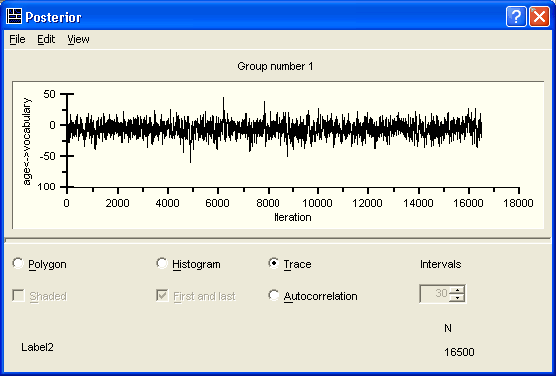
The trace plot, sometimes called a time-series plot, shows the sampled values of a parameter over time. This plot helps you to judge how quickly the MCMC procedure converges in distribution—that is, how quickly it forgets its starting values.

The plot shown above is quite ideal. It exhibits rapid up-and-down variation with no long-term trends or drifts. If we were to mentally break up this plot into a few horizontal sections, the trace within any section would not look much different from the trace in any other section. This indicates that the convergence in distribution takes place rapidly. Long-term trends or drifts in the plot indicate slower convergence. (Note that "long-term" is relative to the horizontal scale of this plot, which depends on the number of samples. As we take more samples, the trace plot gets squeezed together like an accordion, and slow drifts or trends eventually begin to look like rapid up-and-down variation.) The rapid up-and-down motion means that the sampled value at any iteration is unrelated to the sampled value k iterations later, for values of k that are small relative to the total number of samples.