IBM® SPSS® Amos™ 28
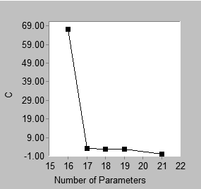
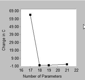
Displays a "scree plot". A scree plot shows first order differences in the "best fit" graph. Below is an example of a best fit graph and the corresponding scree plot.
|
|
Best fit |
Scree |
The best fit graph shows that the best 16-parameter model has C = 67.342 while the best 17-parameter model has C = 3.071. That is, the best 17-parameter model fits better than the best 16-parameter model, with the difference being 67.342 - 3.071 = 64.271. This difference appears in the scree plot, where the point with coordinate 17 on the horizontal axis has coordinate 64.271 on the vertical axis. Similarly, the height of the scree plot at 18 parameters shows the improvement in C obtained by moving from the best 17-parameter model to the best 18-parameter model, and so on. The point located above 21 on the horizontal axis of the scree plot requires a separate explanation. In this example, there is no 20-parameter model with which the best 21-parameter model can be compared. The best 21-parameter model (with C = 0) is therefore compared to the best 19-parameter model (with C = 2.761). The height of the 21-parameter point in the scree plot is calculated as (2.761 – 0)/2. That is, the improvement in C obtained by moving from the best 19-parameter model to the best 21-parameter model is expressed as the amount of reduction in C per parameter.
In the above example, either the best fit graph or the scree plot can be used to support a heuristic "point of diminishing returns" argument in favor of 17 parameters. There is this difference: in the best fit graph, one looks for an "elbow" in the graph, or a place where the slope changes from relatively steep to relatively flat. For the present problem, this occurs at 17 parameters, which can be taken as support for the best 17-parameter model. In the scree plot, one also looks for an elbow, but the elbow occurs at 18 parameters in this example. This is also taken as support for the best 17-parameter model. In a scree plot an elbow at k parameters provides support for the best (k-1)-parameter model.
The scree plot is so named because of its similarity to the graph known as a scree plot in principal components analysis (Cattell, 1966). In principal components analysis, a scree plot shows the improvement in model fit that is obtained by adding components to the model, one component at a time. The scree plot presented here for SEM shows the improvement in model fit that is obtained by incrementing the number of model parameters. The scree plot for SEM is not identical in all respects to the scree plot for principal components analysis. For example, in principal components one obtains a sequence of nested models when introducing components one at a time. This is not necessarily the case in the scree plot for SEM. The best 17-parameter model, say, and the best 18-parameter model may or may not be nested. Furthermore, in principal components, the scree plot is always monotone non- increasing, which is not guaranteed in the case of the scree plot for SEM, even with nested models. Indeed, the scree plot for the present example is not monotone.
In spite of the differences between the traditional scree plot and the scree plot presented here, it is proposed that the new scree plot be used in the same heuristic fashion as the traditional one. A two-stage approach to model selection is suggested. In the first stage, the number of parameters is selected by examining either the scree plot or the short list of models. In the second stage, the best model is chosen from among those models that have the number of parameters determined in the first stage.

